Does Post-Earnings-Announcement Drift Still Work? We Tested 50,000 Earnings Events
PEAD — buy the stocks that beat earnings, ride the drift for a quarter — is one of the oldest documented anomalies in finance, and it's being resold today in glossy PDFs with smooth green equity curves. We tested it on 50,152 real earnings events across the S&P 500, 2000–2026, with consensus-estimate surprises and real prices. The drift is real. About two-thirds of the marketed 'edge' is not — it's survivorship bias. Here's how to tell the difference.
Post-earnings-announcement drift is back in the marketing rotation. The PDFs look the same every cycle: a green equity curve compounding smoothly above the S&P, a couple of academic citations (Bernard & Thomas, 1989), one cherry-picked stock that ran for months after a beat, and an “enhanced institutional model” that outperforms everything. One landed in our inbox, so we did what we always do — rebuilt the claim from raw data and let it defend itself.
The setup: 50,152 real quarterly earnings events across the S&P 500 (503 names), 2000–2026, with actual reported EPS vs. the consensus estimate at the time — the surprise — and split/dividend-adjusted daily prices. Entry at the close of the first trading day after the report (the announcement-day jump is not tradable; we skip it). Abnormal return measured against SPY over 5, 20 and 60 trading days.
One stat does the judging here: t (the t-statistic) measures how far a result sits above zero relative to its own noise — |t| above 2 is a real result (<5% chance of luck), anything between −2 and +2 is indistinguishable from noise. We aggregate by month before computing it, so clustered earnings weeks can’t inflate significance.
The headline number looks great — and it’s a trap
Sort all 50k events into deciles of earnings surprise and measure the 60-day drift versus SPY:
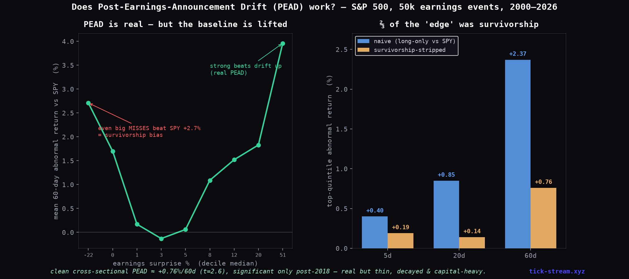
Two things are true in that left panel at once:
- PEAD is real. Drift rises with surprise on the positive side — the strongest beats drift +3.96% above SPY over 60 days, and the naive top-quintile signal clocks t-stats up to 6.4. The market genuinely underreacts to earnings news.
- The baseline is rigged. Look at the far left: the worst earnings misses — bottom decile, median surprise −22% — also “beat” SPY, by +2.71%. Companies that badly miss earnings do not systematically outperform the index. What you’re seeing is that our universe is today’s S&P 500 members: survivors, winners, the stocks that grew into the index. Everything they do “beats SPY” on average.
That’s survivorship bias, and it inflates every long-only, current-universe backtest you’ll ever see sold.
Stripping the survivorship
The fix: benchmark each event against the equal-weight average of the universe itself in the same month, instead of against SPY. Whatever lift the survivor universe provides, both sides get it — only the cross-sectional signal remains.
The top-quintile “buy strong beats” signal after the fix:
| Horizon | Naive (vs SPY) | Clean (vs universe) |
|---|---|---|
| 5 days | +0.40% | +0.19% (t = 2.5) |
| 20 days | +0.85% | +0.14% (t = 0.9 — noise) |
| 60 days | +2.37% | +0.76% (t = 2.6) |
About two-thirds of the marketed edge evaporates. What survives is a ~0.76%-per-event drift over a quarter — real, but thin. And the era split is uncomfortable: the clean signal was not significant in 2000–2009 (t = 0.5) or 2010–2017 (t = 0.6); only 2018–2026 clears the bar (t = 3.0). A fragile, regime-dependent remnant.
The equity-curve version
Calendar-time portfolio: hold every top-quintile beat for 60 trading days (~84 names at any time), market-neutral.
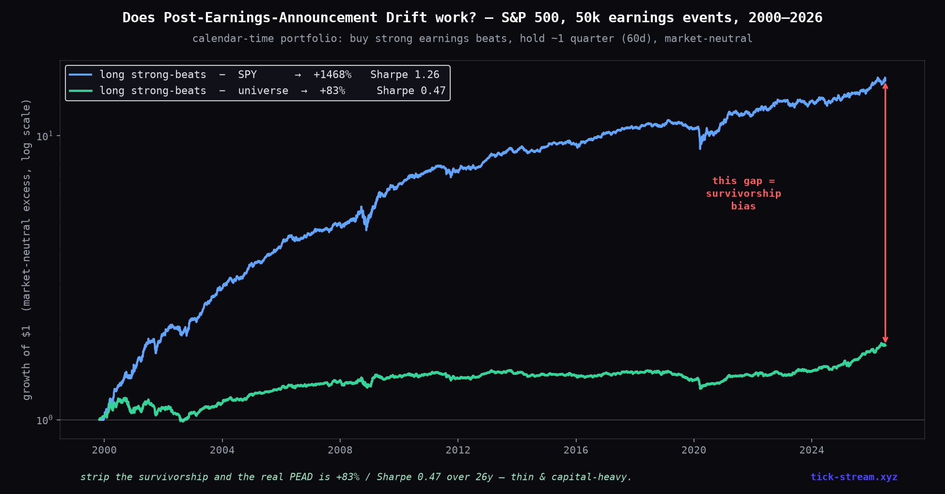
- Hedged against SPY: +1,468%, Sharpe 1.26. This is the curve the PDFs show you.
- Hedged against the universe itself: +83% over 26 years, Sharpe 0.47. This is the strategy.
The gap between those two lines is not alpha. It’s the index-inclusion lottery, harvested in hindsight — before single-stock commissions, borrow costs on the short side, and the operational reality of rebalancing ~84 positions through every earnings season.
Why futures traders can’t use it anyway
PEAD is a cross-sectional single-stock effect. The edge lives in the dispersion between hundreds of individual names — each with its own report date and surprise. An index future aggregates exactly that dispersion away: within any quarter some NQ components beat and some miss, and at the index level the surprises net to roughly zero. There is no earnings surprise on NQ to trade. The only futures-adjacent angle — index volatility around mega-cap report dates — is an options/vol phenomenon, not drift (we tested that family separately; it died too).
The bottom line
The academic effect is real and our data confirms it: markets underreact to earnings surprises, and strong beats drift for weeks. But the tradable remnant is ~0.76% per event over a quarter, intermittently significant, concentrated where costs are worst, and requiring a hundred-position long/short book to harvest. The glossy version — smooth curve, triple-digit compounding, “enhanced execution model” — is two-thirds survivorship bias with a literature citation stapled on.
The transferable lesson is bigger than PEAD: check the bottom of your ranking. If the stocks your signal hates still beat the benchmark, your universe is doing the lifting — and no amount of execution enhancement fixes that.
Methodology: 50,152 quarterly earnings events, 503 current S&P 500 constituents plus SPY, 2000–2026. Surprise = reported vs. consensus EPS (Alpha Vantage point-of-report data). Entry at the first close after the reported date; abnormal returns vs SPY and vs the equal-weight universe mean per month; t-stats on monthly-aggregated means. Costs modeled at 10bps round-trip per event. Caveat: a current-members universe cannot fully remove survivorship — which is precisely the point this article demonstrates; a delisting-complete universe would make the clean numbers weaker, not stronger.
Frequently asked questions
Does post-earnings-announcement drift (PEAD) still work?
The effect exists but it is thin. On 50,152 S&P 500 earnings events (2000–2026), stocks in the top quintile of earnings surprise drifted +2.37% above SPY over the next 60 days — but even the WORST misses 'beat' SPY by +2.0%, because a current-members universe is made of winners. Benchmarked against the universe itself, the clean PEAD effect is only ~+0.76% per event over 60 days (t = 2.6), and it was statistically significant only in the 2018–2026 era. Real, but a fraction of what's marketed.
How much of the marketed PEAD edge is survivorship bias?
In our test, roughly two-thirds. A calendar-time portfolio that buys strong beats and hedges with SPY shows +1,468% (Sharpe 1.26) — but the same portfolio benchmarked against its own survivor universe collapses to +83% (Sharpe 0.47) over 26 years. The giveaway: the bottom quintile — the big earnings MISSES — also beat SPY, by +2.7% per event. When your losers beat the benchmark, your universe is doing the work, not your signal.
Can you trade PEAD with futures?
No. PEAD is a single-stock, cross-sectional effect — the edge comes from dispersion across hundreds of individual names, each with its own earnings date and surprise. An index future like NQ or ES aggregates all of them: some components beat, some miss, and the surprises net out at the index level. There is no 'index earnings surprise' to trade. To harvest PEAD you'd need a long/short basket of ~80–100 individual stocks held for a quarter — a completely different operation from futures trading.
Why did PEAD weaken after it was published?
PEAD was documented academically in 1968 and mapped in detail by Bernard & Thomas in 1989. Once an anomaly is public, capital crowds it and the easy part gets arbitraged away. Our era split shows exactly that pattern in the naive numbers (from +3.5% per event in 2000–2009 to ~+1.5% after 2018) — and the survivorship-clean version is even thinner and only intermittently significant. What survives is concentrated in smaller, less-liquid names where trading costs eat most of it.
How do you remove survivorship bias from a backtest?
The honest fix is a point-in-time universe including delisted stocks, which most free data sources don't offer. A practical diagnostic: benchmark your signal against the equal-weight average of your own universe rather than an index. If your 'edge' shrinks dramatically — ours fell from +2.37% to +0.76% per event — the difference was survivorship, not signal. Also check the bottom of your ranking: if the worst names on your signal still beat the index, your universe is pre-selected winners.