Largest Option Prints: Where the Big Money Goes, and What It Doesn't Tell You
The largest-prints panel lists the session's biggest option trades by premium, with side, strike and days to expiry on every row. On seven years of QQQ and SPY data, a third of all option premium now expires the same day, and the lean of the biggest prints describes the session they trade in, not the next one.
The largest-prints panel answers a simple question: where did the real money go today? It lists the session’s biggest option trades on the ETF behind your chart, QQQ for NQ and SPY for ES, sorted by what they cost to put on. Every row carries the side, the strike, the days to expiry and the premium, so “bought 5,000 calls” becomes buy CALL 720, 0dte, $952k.
This page explains how the list is built, what our own seven-year archive says about the kind of money on it, and where its usefulness stops. The short version: it is an honest picture of the session’s biggest decisions, a large share of them are same-day bets, and their lean tells you about today, not tomorrow.
How the terminal builds the list
- Ranked by premium, not by contracts. Premium is contracts × price × 100, the dollars actually committed. Ranking by size would fill the list with penny options: ten thousand contracts at $0.02 is $20,000 and says little, two hundred at $34 is $680,000 and is a decision.
- Sweeps are merged. An intermarket sweep is one order executed across several exchanges at once. The terminal adds those fragments back together per contract and second, at their size-weighted average price, so the order ranks as the one trade it was.
- Side from the quote. Each print is compared with the bid and offer at that moment: nearer the ask is a buy, nearer the bid a sell, exactly at the midpoint stays mid. Across seven years about 6% of the list’s rows were mid.
- The two nearest expirations. The list reads the session’s tape on the two closest expiries, which on most days today means 0DTE and 1DTE. That is where the prints that matter for the session’s hedging sit, and it is also why the expiry column is not decoration.
The panel shows the top ten, colours bought calls and sold puts green and the opposite red, and updates through the session.
What our data says, part 1: the money moved to same-day expiry
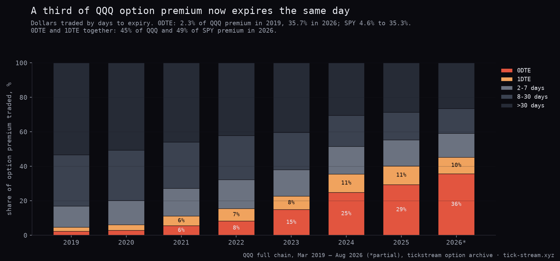
A million dollars of 0DTE and a million dollars of four-week options are different trades. The first is a bet on the next few hours, with its gamma concentrated around spot; the second is mostly time value and volatility. So the first thing we measured is how the premium traded in QQQ and SPY options splits by days to expiry, across the whole chain, year by year.
| Share of option premium traded | 2019 | 2022 | 2024 | 2026 (to Aug) |
|---|---|---|---|---|
| QQQ, 0DTE | 2.3% | 8.2% | 24.8% | 35.7% |
| QQQ, 0DTE + 1DTE | 4.6% | 15.4% | 35.5% | 45.2% |
| QQQ, more than 30 days | 53.3% | 42.1% | 30.4% | 26.5% |
| SPY, 0DTE | 4.6% | 12.0% | 22.5% | 35.3% |
| SPY, 0DTE + 1DTE | 12.2% | 22.5% | 36.6% | 48.7% |
In 2019 more than half of QQQ premium went into options with over a month to run. In 2026, more than a third expires the same day and nearly half within two sessions. A list that showed only size and strike would be mixing these two worlds without telling you, which is why the expiry sits on every row.
The biggest prints are also a small slice of the flow. On the nearest expiry, the day’s twelve largest QQQ prints were a median 12.7% of that expiry’s premium in 2019 and 1.3% in 2026. The typical twelfth-largest print in 2026 was about $279,000, the typical largest about $1.1 million. The list shows you the biggest single decisions, not the bulk of the tape.
What our data says, part 2: it describes today, not tomorrow
The tempting read is that big money knows something. We rebuilt the terminal’s list, with its own rules, from the full QQQ nearest-expiry tape for every session from March 2019 to August 2026, and asked two questions of it.
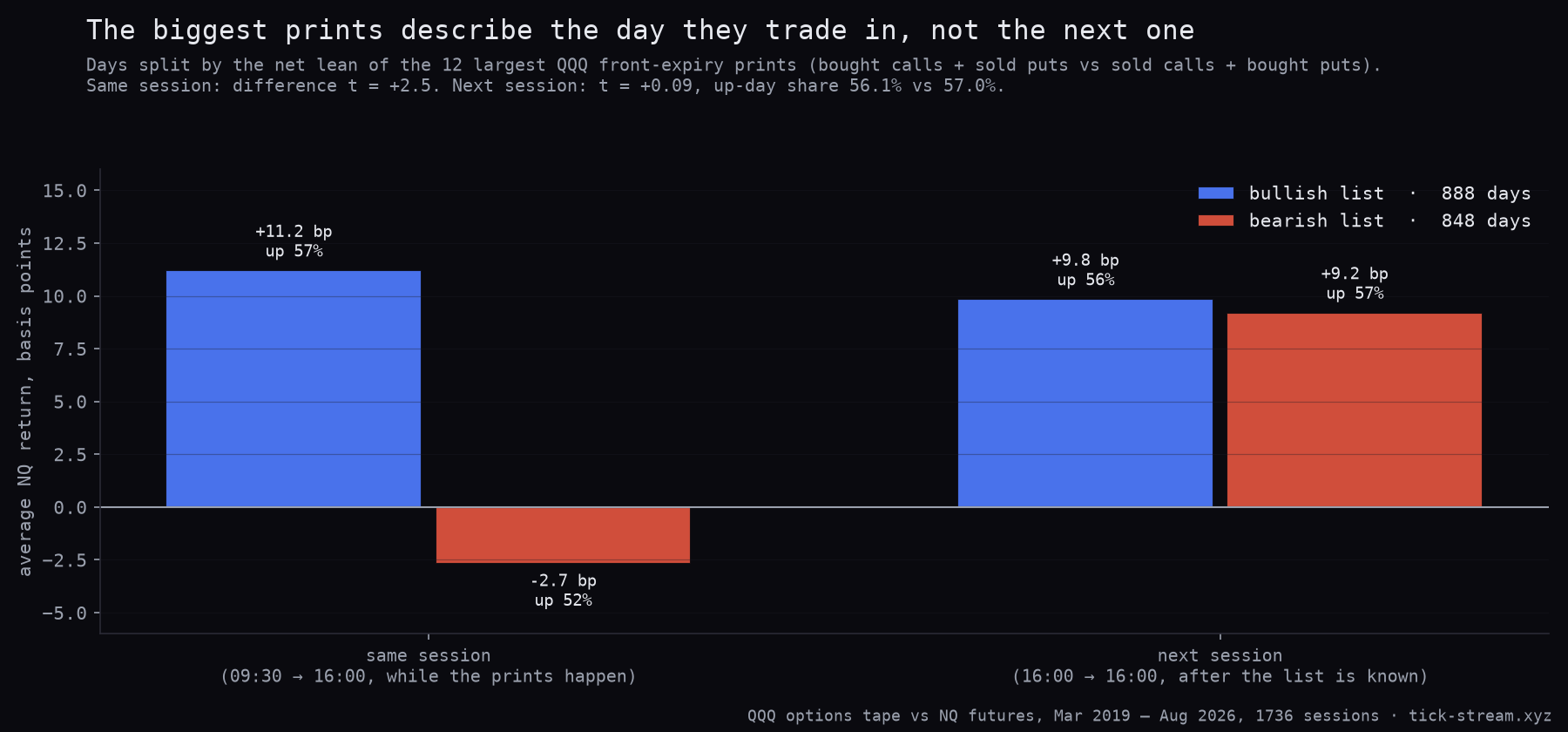
Does the list’s lean at the close say anything about the next session? We split days by the net lean of the twelve largest prints (bought calls plus sold puts against sold calls plus bought puts) and measured NQ futures.
| NQ after the list | Bullish list (888 days) | Bearish list (848 days) | Difference |
|---|---|---|---|
| Same session, 09:30 to 16:00 | +11.2 bp, up 57.3% | −2.7 bp, up 52.5% | t = +2.5 |
| Next session, close to close | +9.8 bp, up 56.1% | +9.2 bp, up 57.0% | t = +0.09 |
During the session the lean and the market agree, which is what you would expect: the prints are part of the same move, and some of them are reactions to it. Once the list is final, it says nothing about the next day. Both groups rose about as often.
Does a single big print carry the next hour? We took every print at the moment it entered the running top ten between 10:00 and 15:00 ET, 28,278 of them on 1,822 days, and measured NQ over the following 15 and 60 minutes in the print’s direction. The average was +0.46 bp at 15 minutes and +0.88 bp at 60, roughly 0.7 and 1.4 NQ points at the sample’s average price. That is against a round trip of about 0.7 points in costs. More telling: when we shuffled the bullish and bearish labels among the same day’s big prints, the shuffled lists did as well or better 21% of the time at 15 minutes and 47% at 60. The individual print’s side adds nothing beyond the day’s overall lean, and in the 2023 to 2026 half the 60-minute figure fell to +0.36 bp (t = +0.8). Prints of $1 million or more looked larger, +3.3 bp at 60 minutes, but on 420 days that was not significant (t = +1.6).
This fits what we have found elsewhere: options data describes the session it trades in, and the directional read from the tape is coincident rather than predictive.
How to read it in the terminal
- Read the expiry before the side. A green 0DTE row is a bet on the next hours near spot. A green row further out is positioning that the session’s range will barely touch.
- Look for clusters, not single rows. Several of the top rows at the same strike and expiry say where the session’s attention is. Put that strike next to the gamma levels and the volatility regime.
- Use the lean as a description. A list that is mostly red on a falling day confirms what the tape is doing. It does not add a forecast for the next session.
- Treat mid rows as unknown. A print at the midpoint could be either side. The row’s colour is not a reading of intent.
Limits worth knowing
- One leg at a time. A bought call can be half of a spread, a hedge or a roll. The tape shows the leg, not the strategy.
- The quote rule is an inference. It reads which side of the spread a print was nearer to. The terminal’s customer-volume split is calibrated against clearing data, but the side of an individual print cannot be checked against anything.
- The study used the nearest expiry. Our archive holds the full tape for the front expiration every day; the live list also reads the next one. On days without a same-day expiry, mostly before 2022, the front expiry was a few days out.
- Daily study, one underlying. The direction tests use QQQ prints against NQ futures. We did not run the same test for SPY against ES.
Methodology: tickstream option archive. Expiry split: QQQ and SPY end-of-day records for every listed contract, March 2019 to August 2026; premium approximated as volume × (high + low + close) / 3 × 100, days to expiry in calendar days as in the terminal. List reconstruction: full trade and quote tape of the nearest QQQ and SPY expiration for about 1,870 sessions per symbol, rules identical to the terminal (premium = size × price × 100, sweep fragments merged per contract per second at size-weighted price with size-majority side, side by aggressor flag or quote rule against the NBBO midpoint, top 12 by premium). Lean = sign of Σ premium × side × (+1 call, −1 put) over the day’s final top 12; NQ continuous front month, 09:30 open and 16:00 close ET. Intraday: every print entering the running top ten between 10:00 and 15:00 ET, mid prints excluded, forward return from the close of the print’s minute; day-clustered and premium-weighted, placebo = 1,000 shuffles of the side labels within each day. Cost reference: $14.50 round trip = 0.725 NQ points.
Frequently asked questions
What counts as a large option print?
In the terminal it is a ranking, not a fixed dollar threshold: the session's prints on the two nearest expirations, sorted by premium (contracts × price × 100), with the top ten shown. In QQQ in 2026 the twelfth-largest print of a typical day was worth about $279,000 and the largest about $1.1 million. A fixed threshold would fill the list with noise on busy days and leave it empty on quiet ones.
Do large option trades predict where the market goes?
Not beyond the session they trade in, in our data. On 1,736 sessions from 2019 to 2026, days when the biggest QQQ prints leaned bullish closed NQ higher than days when they leaned bearish, while those prints were happening. The next session was the same after either: up 56.1% of the time after a bullish list and 57.0% after a bearish one. Intraday, the edge after a print enters the list was under 1.5 NQ points at 60 minutes and not distinguishable from shuffled labels.
Why does the expiry matter for an option print?
Because the same premium buys very different exposure. A 0DTE option is mostly a bet on the next few hours and its gamma is concentrated near spot; four-week paper carries far more time value and moves with volatility. Same-day expiries went from 2.3% of QQQ option premium in 2019 to 35.7% in 2026, so on a typical day a large share of the biggest prints are same-day bets.
How does the terminal know if a print was bought or sold?
It compares the print with the national best bid and offer at that moment. Nearer the ask is a buy, nearer the bid is a sell, and a print exactly at the midpoint is shown as 'mid' because it genuinely does not say who initiated. Intermarket sweeps, one order split across exchanges, are merged back into a single row per contract per second, so a 4,500-lot order does not show up as thirty small fragments.
Is a bought call on the list the same as a bullish bet?
Not necessarily. The row shows one leg. It could be half of a spread, a hedge against a short stock position, or a roll. The colour on the list is a mechanical reading (bought calls and sold puts are green, sold calls and bought puts are red), not a statement of intent.