Liquidity Heatmap: How Much of a Bright Wall Is Still There When Price Arrives
The liquidity heatmap draws resting depth from our own Level 2 recording behind the candles. We followed 4,306 large resting orders in NQ until price reached them: a median 87% of the size was still there, but 29% had lost more than half, the biggest walls were the least reliable, and price held at walls no more often than at ordinary levels.
The liquidity heatmap paints the order book behind the candles. Every price gets a colour for the contracts resting there, from near-black blue where the book is thin, through cyan, into yellow and orange where the size is. Each column is the book at one moment, so a bright horizontal band is size that sat at a price for a while, and the place where a band stops is the moment it left.
That is the reason to have it. A ladder shows the book now; the heatmap shows what the book did while price moved: which size stayed as price approached, and which was gone before anyone could trade against it.
How the terminal builds it
- From our own recording. The terminal records the full CME Level 2 book, hundreds of price levels a side, about four snapshots a second. It is the same store behind the order book ladder and the historical book data.
- One column per 15 seconds. Each column is the book as it stood at the end of its 15 seconds: resting size by price, nothing averaged or smoothed. A pulled order is simply absent from the next column. Nothing fades out slowly, so what you see as a band is size that was actually displayed at that time.
- At most 240 columns on screen. Zoomed into an hour you see every 15-second column. Across a full day of the default 24-hour lookback, each column is a sample about six minutes apart, and a wall that came and went between two samples is not drawn. Zoom in when the detail matters.
- Only what was measured. Each column is trimmed to the price range that holds 99% of its resting size, and prices outside that range stay transparent. No depth is drawn where none was recorded.
- Colour is relative. Size is mapped on a log scale against the largest cell in the window; the sensitivity slider sets how early a level turns bright.
- Slightly behind live. The recording is written to storage in batches, so the newest columns arrive a few minutes after the tape. The heatmap stops short of the live candle rather than repeating an old column; for depth right now, use the ladder.
What our data says: the brightest walls were the first to go
The question a heatmap invites is simple: if I see a wall, will it be there when price gets to it? We answered it with the terminal’s own view. For five New York sessions of NQ (21–25 September 2026) we rebuilt the 15-second columns from our recording and marked a wall wherever a level 1 to 10 points from the best bid or offer held at least three times the median size of the 60 levels nearest the market on that side. In NQ the median level holds about 4 contracts, so a typical wall was 15. Then we followed each wall forward on a one-second grid of the same recording and the trade tape, until price reached it.
That gave 4,306 walls, and price got to 3,852 of them within 30 minutes, half of them within 33 seconds.
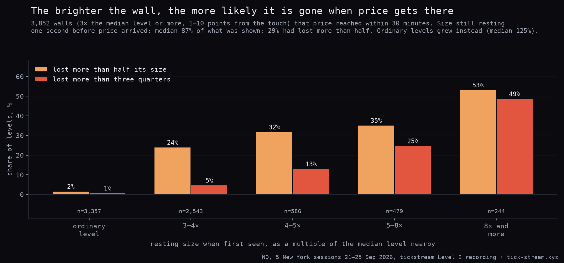
| Wall size when first seen | Walls reached | Median size left on arrival | Lost more than half | Lost more than ¾ |
|---|---|---|---|---|
| Ordinary level (≤ median) | 3,357 | 125% | 2% | 1% |
| 3–4× the median | 2,543 | 87% | 24% | 5% |
| 4–5× | 586 | 88% | 32% | 13% |
| 5–8× | 479 | 93% | 35% | 25% |
| 8× and more | 244 | 27% | 53% | 49% |
| All walls | 3,852 | 87% | 29% | 11% |
- Most walls were mostly there. The median wall still had 87% of its size one second before price arrived, and 39% were the same size or larger. Counted in contracts, 67% of the size the heatmap showed was still resting on arrival.
- But not the brightest ones. The larger the wall relative to its neighbours, the more likely it left. Among walls of eight times the usual size or more, the ones that stand out most on a heatmap, more than half had lost most of their size before price arrived.
- Ordinary levels did the opposite. Plain levels grew as price came towards them (median 125%), which is what normal queueing looks like. Part of the walls’ shrinkage is simply that a level picked for being unusually large tends to get smaller again, but that is the point for a reader of the heatmap: the unusual bright spot is the part least likely to be there.
- Distance matters. Walls within 2.5 points of the market lost more than half in 19% of cases; walls 2.5 to 10 points away in 30–31%, with more time for someone to change their mind.
And the walls that stayed did not stop price
The second half of the question is whether a wall that is still there holds price. We ran a race from the moment price reached the level: did it trade one point back away before it traded one point through, within five minutes? As a control, each wall was paired with an ordinary level at the same distance, on the same side, in the same 15-second column.
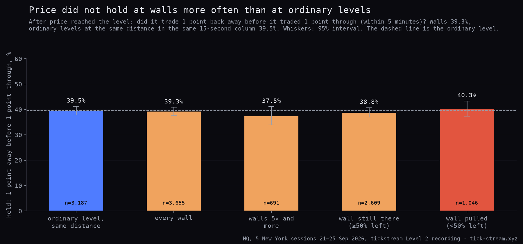
| Level price reached | Held | Races |
|---|---|---|
| Ordinary level, same distance | 39.5% | 3,187 |
| Every wall | 39.3% | 3,655 |
| Walls 5× and more | 37.5% | 691 |
| Wall still there (≥ 50% left) | 38.8% | 2,609 |
| Wall pulled (< 50% left) | 40.3% | 1,046 |
There is no difference. Price held at walls as often as at ordinary levels, day by day within 1.4 percentage points either way, and the biggest walls did slightly worse, not better. In NQ a wall of 15 or 20 contracts is small next to the volume that trades through a price in a busy second. It matches what we found studying the book itself: order-book imbalance moves the next tick, but by less than the spread, and a single deep price is not a floor.
How to read it
- Watch the band end, not just the band. The heatmap earns its place when a wall disappears as price approaches. That is information the ladder shows for a moment and then forgets. Over a few minutes it tells you which size was there to trade and which was only displayed.
- Treat a bright wall as a claim, not a floor. Most walls were mostly there, but the brightest were a coin flip. Do not hide a stop just behind one on the assumption it will absorb the move.
- Use it for placement and context. Where resting size really does sit is useful for where you work an order and where you expect fills to get thin. Prices where a lot has already traded are a better guide to where price gravitates: in our NQ research they acted as mild magnets, an effect of about one and a half percentage points, useful for placing a target and not for choosing a side (more in our effort-versus-result study).
- Pair it with the footprint. If a wall is still there and the footprint shows volume trading into it without price moving, size really was absorbed. If the band simply ends, it was pulled.
Limits
- Displayed size only. Level 2 is size per price, as the exchange displays it. Iceberg reserves, orders that are not displayed and orders sent the instant price arrives are invisible to any heatmap. For what individual orders do, see Level 3 market-by-order data.
- A band is many orders. In NQ nearly every resting order is a single contract, so a 20-lot level is usually many traders, not one. A wall shrinking is people cancelling, not necessarily one spoofer.
- Sampling. Columns are 15 seconds at best and further apart when zoomed out. A wall that lives for three seconds may never be drawn.
- Small sample. Five sessions of one market, one definition of a wall. The share of walls that lost more than half ranged from 24% to 37% by day; treat the exact percentages as indicative.
Methodology: NQ front month, New York session 09:30 to 16:00 ET, 21–25 September 2026, from the tickstream Level 2 recording (full-book snapshots about four a second) and trade tape. Walls identified as the terminal draws them: the last snapshot in each 15-second column; wall = resting size at least 3× the median of the 60 nearest non-empty levels on that side, 4 to 40 ticks (1 to 10 points) from the best bid or offer; one episode per price per 30 minutes; columns seeded until 15:30 ET. Outcomes on a one-second grid (last snapshot each second) starting after the column: arrival = the level became the best bid or offer, was crossed, or traded, within 30 minutes; “size left” = resting size at the level in the last second before arrival divided by the size when first seen. Race: from arrival, first trade 4 ticks beyond the level versus 4 ticks back away, within 5 minutes; the arrival second only counts a break-through, and seconds with both are excluded. Control: a random level with at most the median size, same side, same column, distance within ±2 ticks of the wall’s. Intervals are simple binomial 95% intervals, not clustered by day.
Frequently asked questions
What is a liquidity heatmap?
A liquidity heatmap draws the order book over time: every price level gets a colour for how many contracts are resting there, and each column is the book at one moment. Bright bands are prices where a lot of size is waiting; dark areas are thin. Laid behind the candles, it shows where resting orders sat as price moved towards them, and when they were added or pulled.
Do large orders in the order book act as support and resistance?
Not in our NQ data. In five New York sessions, once price reached a level with at least three times the usual resting size, it moved one point back away before it moved one point through 39.3% of the time. At ordinary levels the same distance from price, in the same moment, the figure was 39.5%. The biggest walls did not do better (37.5%).
How often are big orders pulled before price gets to them?
Often enough to matter. Of 3,852 walls that price reached within 30 minutes, 29% had lost more than half of their size one second before price arrived, and 11% had lost more than three quarters. The larger the wall relative to the book around it, the more likely it was to go: among walls of eight times the usual size or more, 53% had lost more than half.
Can a liquidity heatmap show iceberg orders or hidden liquidity?
No. The exchange's Level 2 feed reports the displayed size at each price. The hidden part of an iceberg order only shows up as it refills, and a heatmap built from the book cannot see size that was never displayed. It also shows the total per price, not the individual orders or their place in the queue.
How often does the terminal's heatmap update?
Our recording stores the full book about four times a second. The heatmap folds that into one column per 15 seconds, the book as it stood at the end of each 15 seconds, and draws at most 240 columns across the window you are looking at. Zoomed to an hour you see every 15-second column; across a full day each column is a sample about six minutes apart. The live order book ladder beside the chart shows depth as it changes.